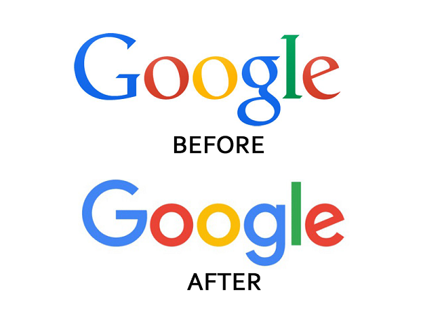
 Several household name brands, including Google, Facebook, and Verizon, rolled out new looks recently. While some were more drastic than others, the theme that reigned supreme in all of these new logos was flat design. Flat design is a minimalistic, streamlined look with none of the drop shadows, textures, or gradients that were all the rage a few decades ago. This look is becoming more and more popular among brands, as proved by this recent bout of redesigns. For the most part, flat logos have been met with general acceptance and praise. In some cases, though, people have argued that they are just too simplistic.
An article in the New Yorker scolded Google for taking away the dignity and authoritativeness of their logo in their recent redesign. “The new logo evokes children’s refrigerator magnets, McDonald’s French fries, Comic Sans,” the article states. “Google took something we trusted and filed off its dignity.” Ouch. Others have argued that this move toward more modern looking logos is a much-needed change. UX Magazine writes that “flat design brings us a step closer to a new paradigm of digital design, where the functionality and aesthetic are in complete harmony.” To break it down, flat logos embrace the streamlined look of today’s websites and help with loading speed in a world where we refuse to wait more than 10 seconds for almost anything. So, what do you think of these updated logos? 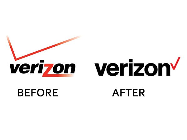
Photos from Business Insider and Design Taxi


